

Auto loan
application
Lead UX Designer | Automotive E-commerce | 2023–2024
Transformed a confusing third-party credit application into a streamlined, analytics-enabled experience, improving completion rates by 40% through strategic content architecture that took total flow steps from 15 to 7.
The Challenge
EchoPark's credit application was embedded in a third-party iframe that frustrated users and blocked internal teams from understanding user behavior. The application had confusing flows, excessive scrolling, and zero analytics tracking - creating a blind spot for identifying drop-off points or measuring performance.
Beyond the technical limitations, the UX had deeper issues: inconsistent requirements across teams, unclear store routing, mixed cosigner information that created in-store confusion, and over-collection of user data.
The Solution
Develop an in-house credit application with streamlined workflows, clear information architecture, and built-in analytics tracking. Eliminate the iframe dependency while reducing user friction by reducing time to complete and giving internal teams visibility into the customer journey.
The Impact
✅ 40% improvement in completion rate: through simplified workflows (15 step process to max of 7 steps) and optimized information architecture
✅ Product leveraging for business gains: credit application experience was so successful it was implemented across +100 franchise websites.
✅ Analytics visibility: Internal teams gained customizable tracking to understand drop-off points and user behavior for the first time
✅ Executive buy-in: Successfully aligned cross-functional requirements and demonstrated the value of bringing design in-house
Before
After
The approach
As lead designer, I drove strategy, research, and design from discovery through launch - collaborating with cross-functional teams and C-suite stakeholders to align requirements and validate solutions.
Strategy & Research
I inherated an incomplete audit from another designer, so I thoroughly documented the existing iframe logic and conducted internal research across teams to understand operational needs vs. user needs.
By creating high-level content wireframes, I effortlessly aligned stakeholders on flow structure and field requirements through strategy sessions with cross-functional teams and leadership.
Design & Iterations
Through prioritizing sketches and mid-fidelity wireframes, we could validate conditional logic and functionality before committing to visual design. I applied EchoPark's design system while introducing new components where needed, animations for moments of delight, and ensuring ADA compliance throughout.
Validation & Testing
To ensure the flow and functionality were usable, we conducted usability testing on the most complex parts of the flow (location selection, navigation patterns, full application walkthrough) and gathered actionable insights to refine interaction patterns.
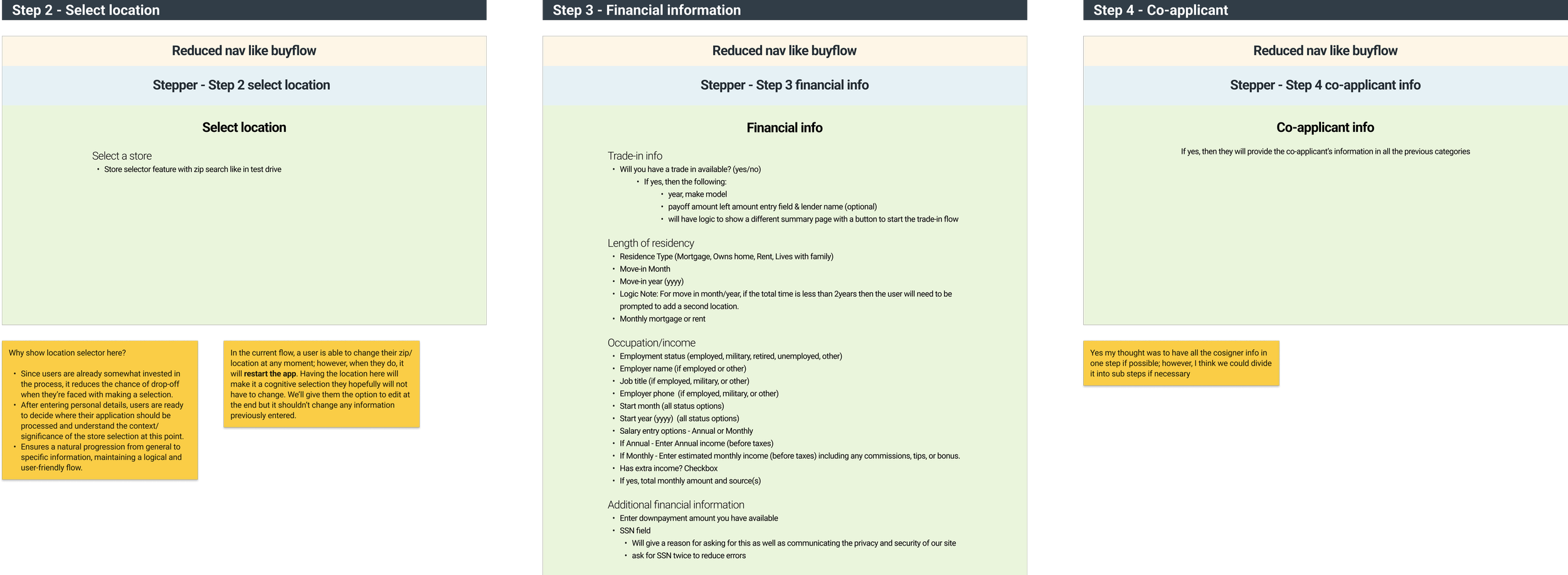
Content strategy alignment visuals.
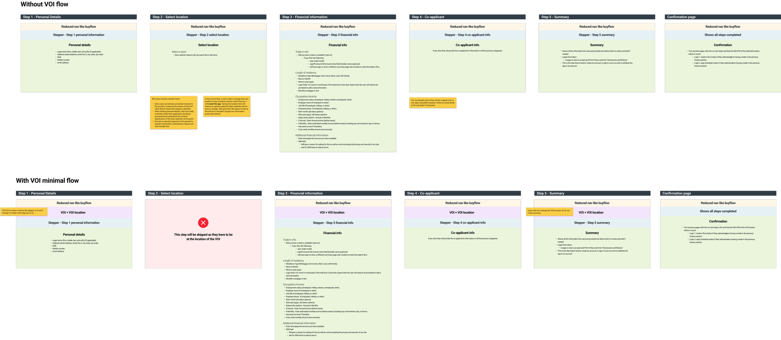
After discovering we'd need two different versions for users with a vehicle of interest and those without
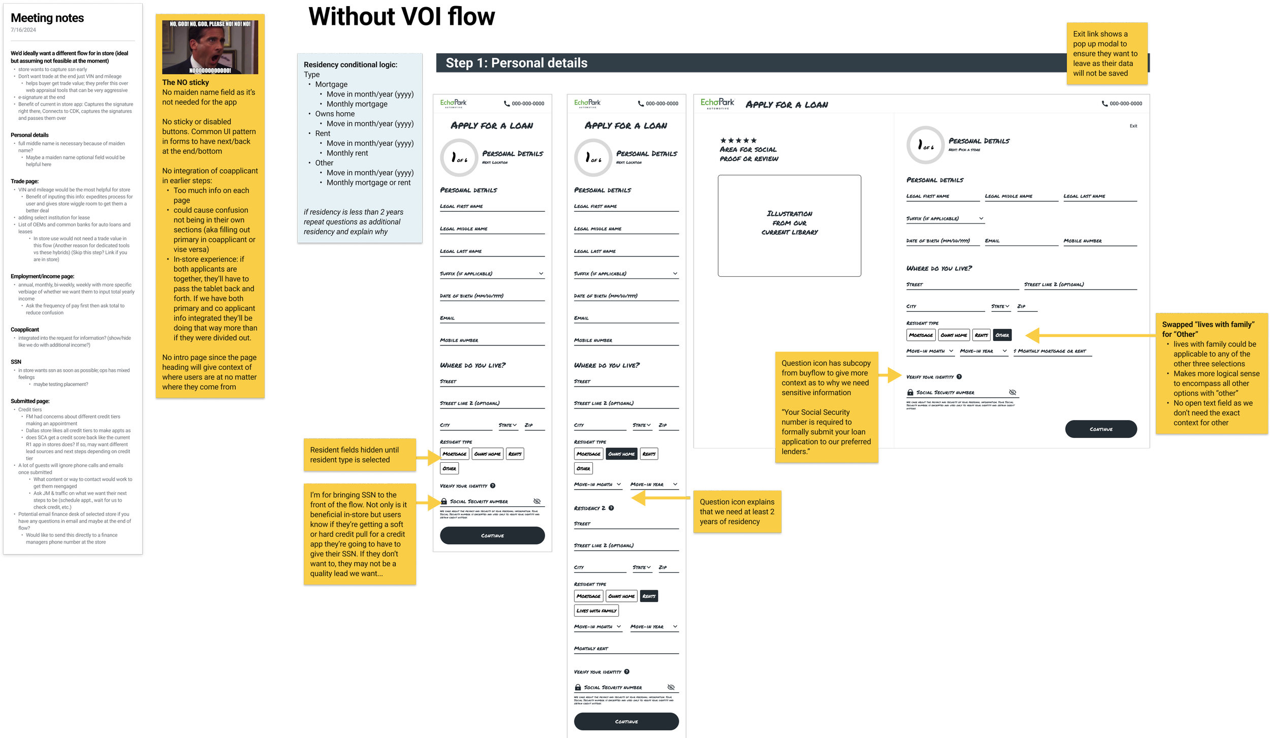
Example of 1 step in the lofi iteration phase
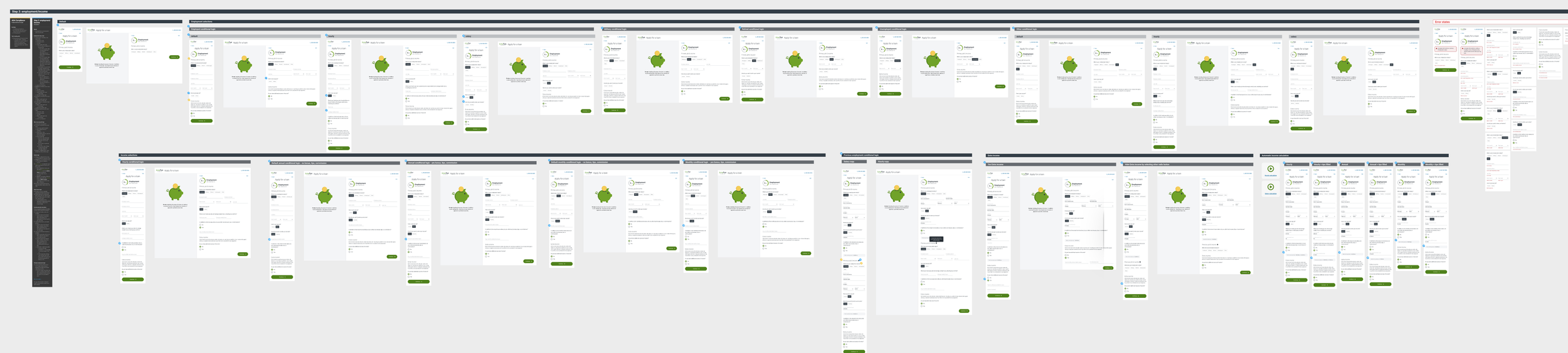
This is an example of the complexities and conditional logic of a single step in the entire flow.
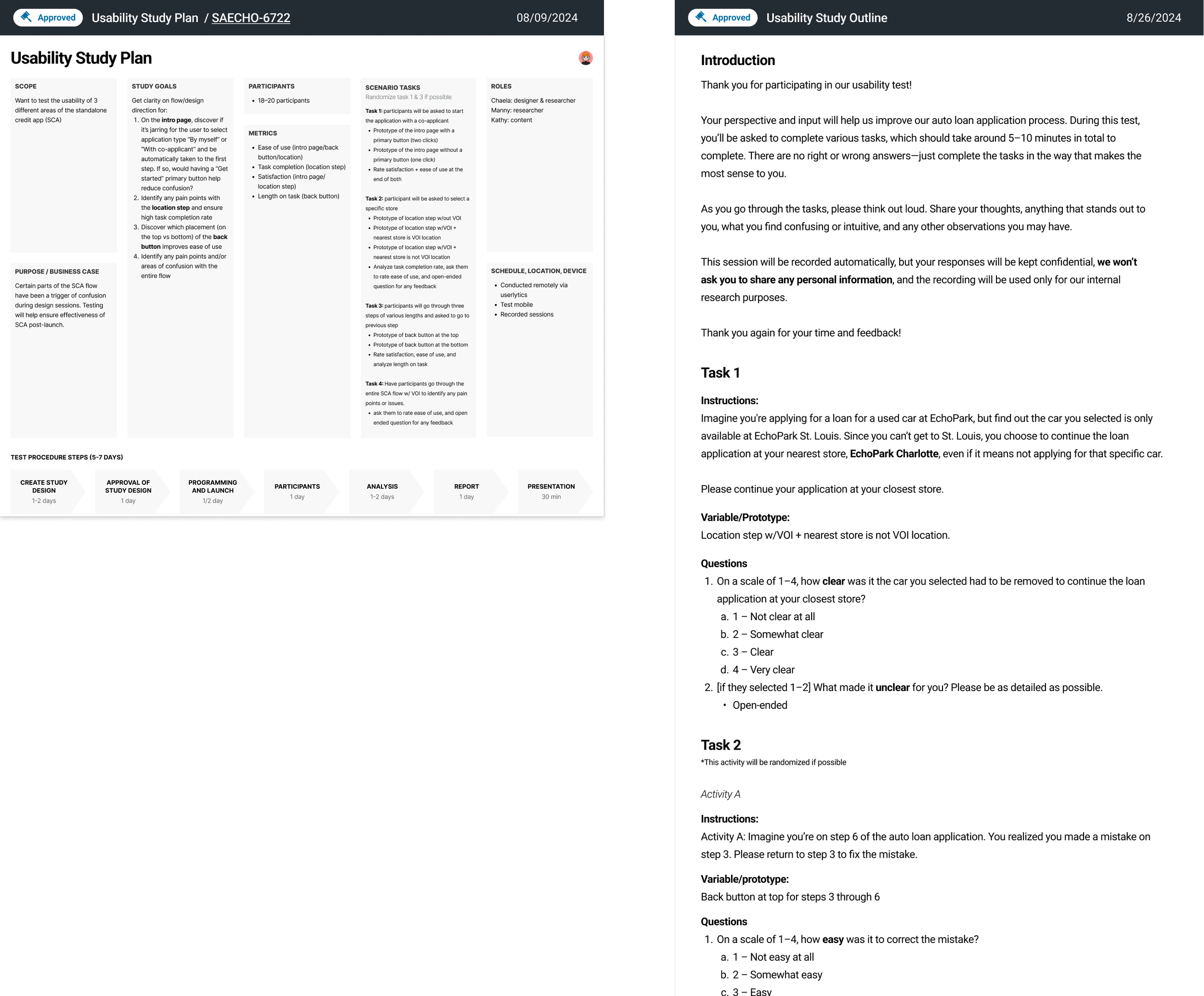
Usability test goals, outcomes, etc.

Key recommendations based on findings:
Ideate when the location confirmation modal appears
Have a back button at the top opposite of exit
Explore dropdown selection after clicking stepper
Add a tooltip to explain how providing extra income could be beneficial
Ideate changing section labels for co-applicants so it’s more clear if they miss step header
Continue with one click to start the app